By Harlan Chapman-Green
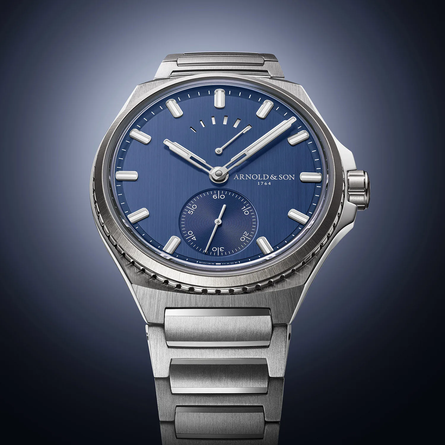
Van Cleef & Arpels is a moderately well-known French jeweller. I say only moderately well known because they don’t advertise as much and make themselves known in the way that Cartier and Tiffany do. Nevertheless, watches such as their Midnight Planetarium watch gain substantial recognition from sources outside of the watch industry for their unique take on, well, pretty much everything.

This new creation was actually unveiled to us in its original form last year at SIHH and is a slim and almost chic travel time watch. The home hours are shown as a number in a window where 11 O’clock would be and the away time in a similar aperture located where 5 O’clock would normally be. There is also a single thin, silvered hand protruding from the centre of the decorated dial which points to a retrograde minutes indicator spread across one part of the outer dial ring, diagonally opposite to the words Heure d’ici & Heure d’ailleurs (Time here and Time there). All three of these functions are set and adjusted through the single crown on the right which means that there aren’t any pushers to clutter up the case.
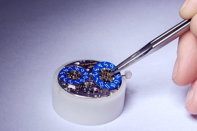
The movement is an automatic calibre which utilises a platinum micro-rotor and has a power reserve of 48 hours and was made by Agenhor specifically for Van Cleef & Arpels to use in this watch. The back of this case has the words “Pièce Unique engraved onto it and the watch is presented on a blue leather strap.
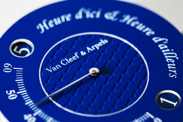
The difference between this and the normal version of the Heure d’ici & Heure d’ailleurs watches is that this version has a Mediterranean style blue on the dial which creates a calming aura, taking the wearer away to their imaginations or perhaps to fond memories of family visits to places like the isle of Capri or the Amalfi coast. The standard version has a silvery dial which is in no way ugly by any means, however, the blue here works so well, contrasting with the white gold of the case superbly. An extra addition to this watch is the piqué motif that’s being used in the central part of the dial. It’s a very simple looking design which makes use of big open shapes joined together. It’s actually a great choice for the design of the watch and the unique colour used on the dial. I have a feeling that a sunburst guilloché pattern or something similar wouldn’t have worked too well, instead we get a design that is uniquely French.

Can you guess what it’ll sell for when it goes under the hammer at Only Watch 2015 in November? For more info, please visit vancleefarpels.com

HARLAN CHAPMAN-GREEN – CONTRIBUTING EDITOR
A keen bass guitar player, Harlan enjoys all the perks modern watchmaking technologies the industry has to offer. Although you might catch him sampling Omegas or the Rolex, Harlan loves all things Haute Horology, with his three favourite brands being Breguet, A.Lange & Söhne and Vacheron Constantin. He hopes to study timekeeping more in depth someday and will never be able to thank his father enough for introducing him to the industry. Read his articles here.