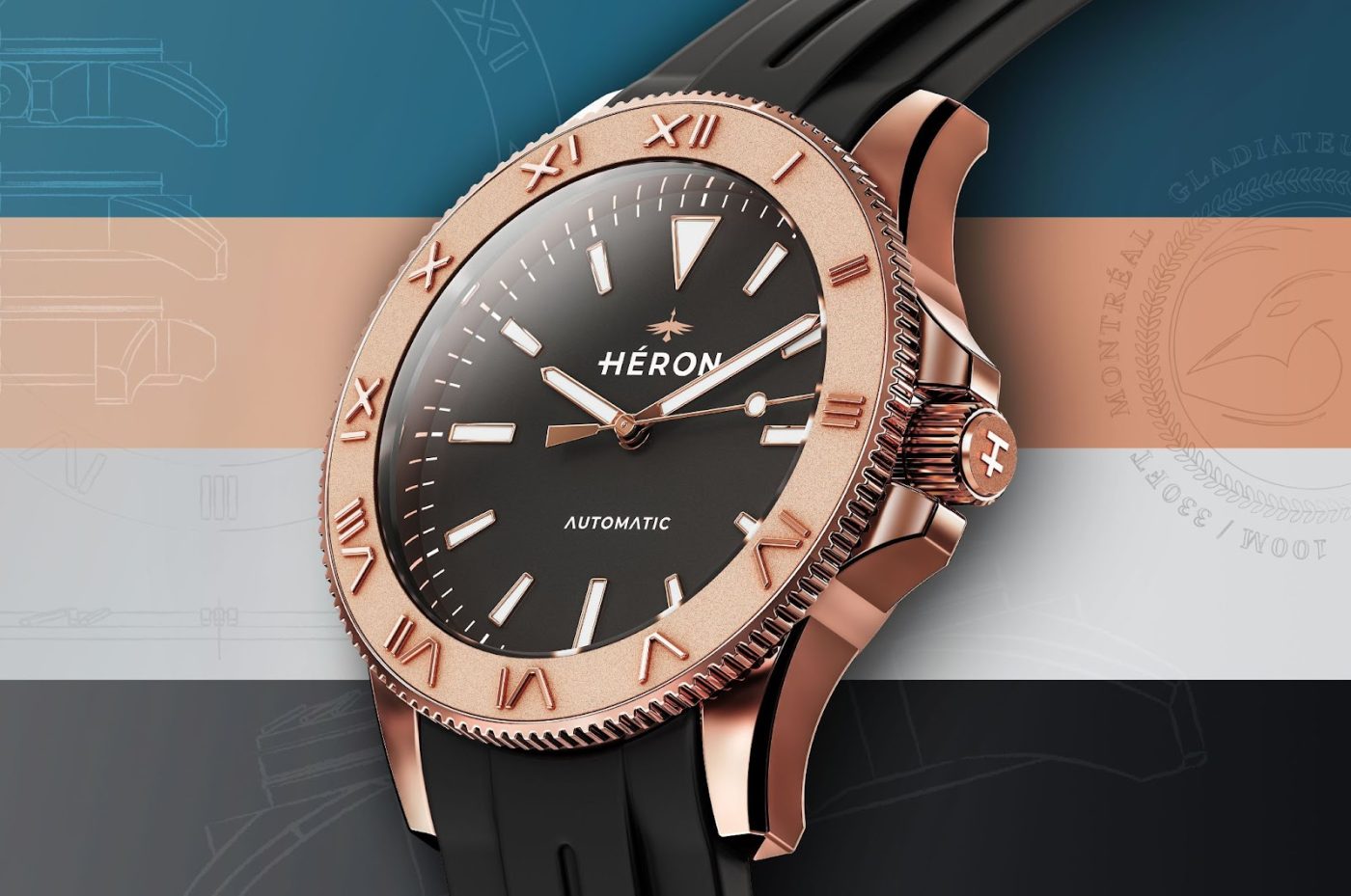
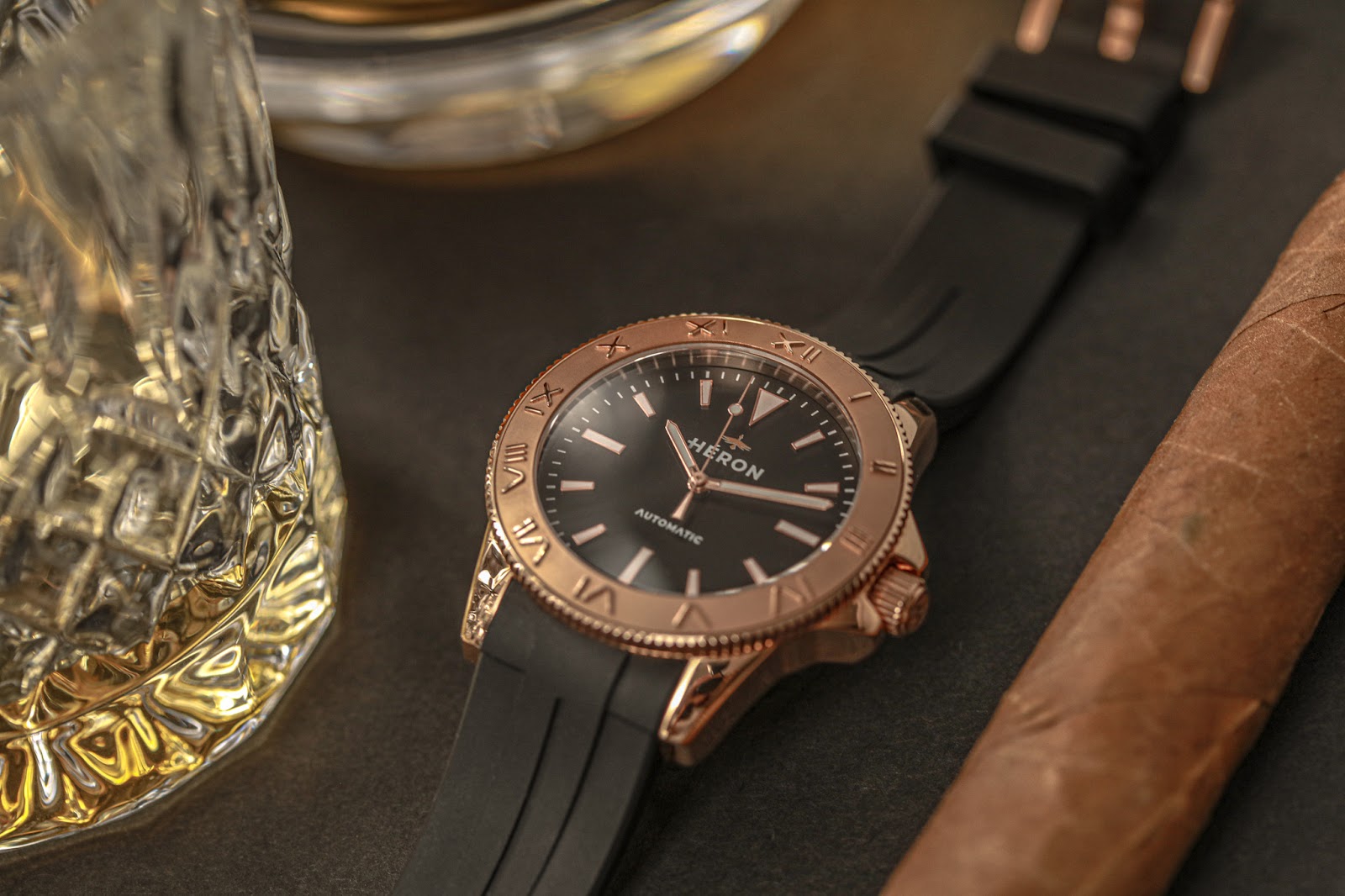
“I am writing you a long letter, because I do not have the time to write you a short one.” This famous quote by the French mathematician Blaise Pascal sums up my feelings about the Héron Gladiateur. Any designer will tell you designing something simple is often far more difficult than designing something complex, but doing so while introducing an element of novelty is an even greater achievement. This elemental design theory, as well as the thrill of taking a risk and defying expectations, drives the Gladiateur to be what it is: A simple watch that is easy on the eyes and feels great on the wrist. And, while this description might fit an astronomical amount of watches, the Gladiateur finds its own unique way of being that.
While it might look the part at first glance, the Gladiateur is not a Diver. The 10 ATM water resistance is 100 meters short of the standard 20 ATM for dive watches. And, the absence of a 60 minutes timing bezel is another step away from the dive watch. The thing about the Gladiateur is that it’s not trying to be a diver, but rather a “diver-style” watch. It is not a diving tool, but a laid-back casual dress piece borrowing the dive watch aesthetic. A look that has far surpassed its utilitarian origins, to become an icon of men’s fashion. A timepiece once worn by diving pioneer Jacques Cousteau, might very well be the next James Bond watch. The diver became a dress watch. An accessory that inspires confidence and taste. The Gladiateur embraces this shift by capturing the timeless look of the diver while enjoying the freedom of lifting its restrictions. Anything is possible now. Even a 12-hour roman numeral bezel.
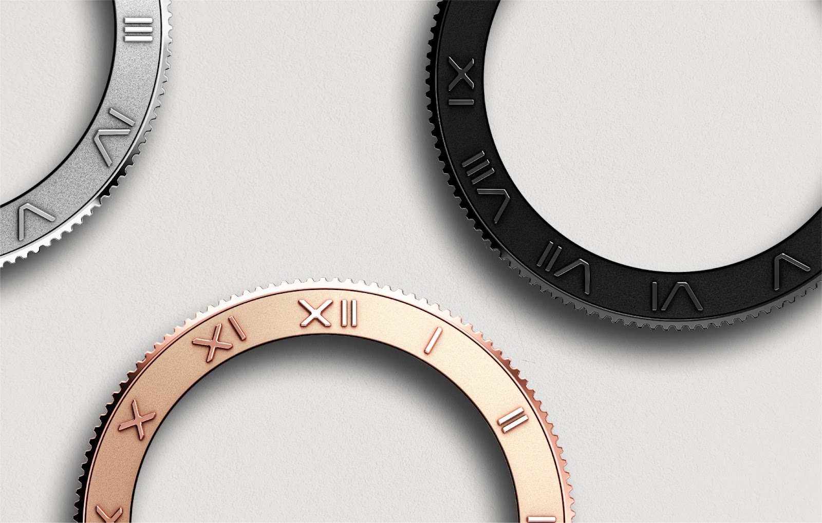
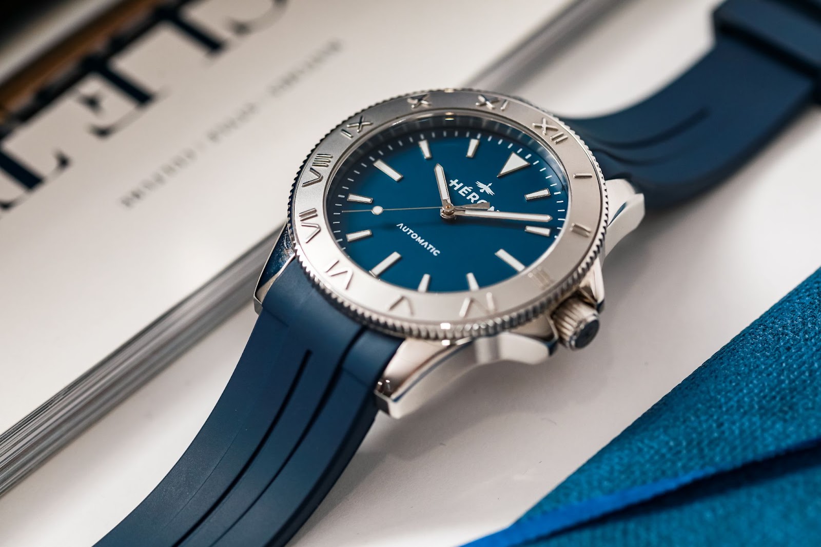
Highlighted by its raised polished Roman numerals against a matte sand-blasted background, the bezel has been the talking point around the Gladiateur since its unveiling. The contrast in finishing between the numerals and the background offers nice legibility despite the tone on tone. Roman numerals are popular on dress watches for their ability to instantly class-up the look of a timepiece. Here, the Gladiateur revisits them in a quasi-futuristic sans serif typeface, bringing a nice balance between dressy and sporty. But what the Roman bezel really brings to the Gladiateur is a “signature look” making this watch instantly recognizable. Though it does not track minutes, the 12h bezel could be used as an “alternative GMT” to track different time zones.
While unconventional, the early responses to the Gladiateur have been pretty positive so far. A quick tour on social media and watch review blogs discussing microbrands is enough to find enthusiasts claiming the Gladiateur is “a breath of fresh air in a sea of homage watches”. But there is more to the Gladiateur than being an unorthodox take on a classic design. Deciding to “keep it clean” and conservative on some elements comes with its own set of challenges. As established earlier, simplicity is difficult to execute, and this is perhaps where the Gladiateur truly shines. The sleek and modern dial relies on nothing more than basic geometry and the primary design principles of contrast, proportion, alignment and repetition. The 3,6 and 9 applied markers are slightly longer rectangles to contrast with the shorter trapezoids and the single triangular marker at 12h. The baton-style sword hands share width with the rectangular markers for a harmonious balance while the lollipop second hand’s counterbalance echoes the trapezoids. (Some suggested it resembles a feather as a reference to the brand name which may or may not be the case but looks good nonetheless). The dial itself comes in 4 matte colorways and displays very little text with just the logo and “automatic” mention (both in a clean and modern sans serif typeface).
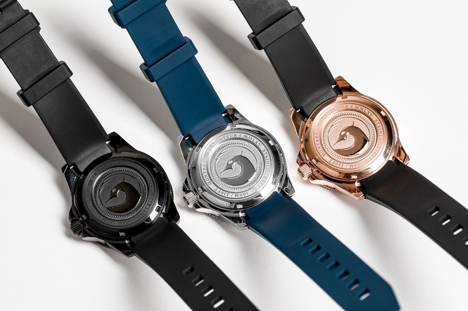
The 41mm case sits nice and close to the wrist due to its curved lugs and integrated strap. The case also features rather restrained crown guards which gives the watch a sturdier look while keeping it dressy. The Gladiateur features a screw-down crown that keeps the watch dust and watertight. Like the bezel, the caseback is another subtle nod to the ancient Roman theme branding this piece. The solid caseback features the hybrid depiction of a majestic heron and a fierce gladiator encircled by laurel leaves. Once again the dual nature of the piece is highlighted by the contrast of the classic serif typeface clashing with the sharp and minimalistic artwork. The integrated rubber strap suits the case and dial nicely in every colorway and is very comfortable overall.
The reliable Miyota 9039 automatic caliber powers the Gladiateur. 9039 is a high beat movement (28,800bph) with a power reserve of 42 hours and an accuracy of -10+30 seconds per day. A solid choice for the price point (even more so if you get the watch at one of the discounts offered during the Gladiateur’s Kickstarter launch).
As mentioned in other reviews of the Héron Gladiateur, “Intent” is the word that comes to mind when discussing this piece. Nothing about it was left to chance despite its seemingly easy design (as a matter of fact it took over a year to hammer it out). It’s a well-specced piece that’s easy to wear and offers a competitive value proposition. It will launch today, on Kickstarter at the starting price of 250$ US.

