
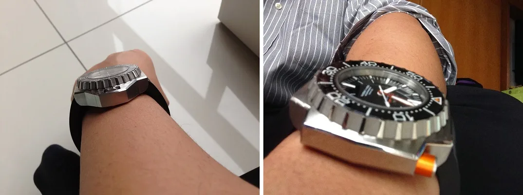
The lugs on the casing is 24 mm. A wise choice as it helps keep the watch in proper perspective.
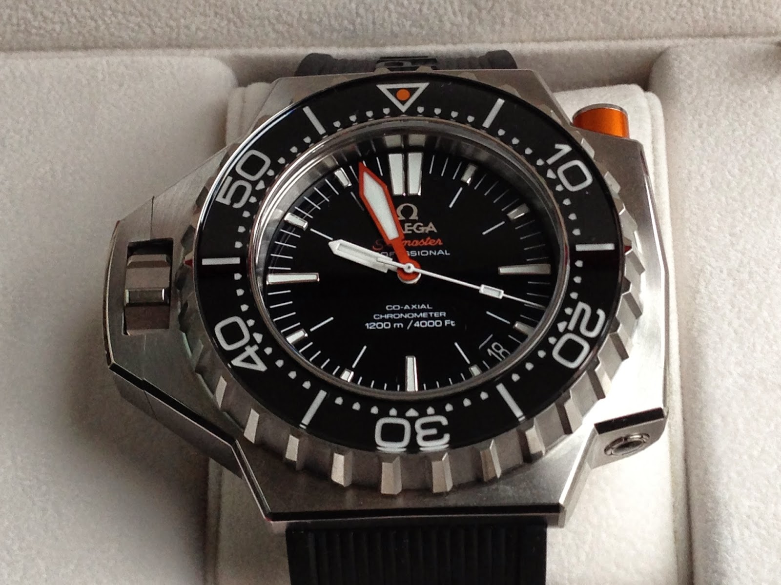
I like the deep black dial with applied OMEGA logo and markers. The dial is highly legible with the trademark double marker at 12 o’clock position and larger markers at 3, 6 and 9 o’clock positions. The date window is between 4 and 5 o’clock positions and inconspicuous. Having a white font on a black background naturally blends it with the dial concept. Instead of replacing two of the minute markers by the date window, Omega chose to keep a small part of the minute markers for a semblance of consistency. If given the option, I would have simply repositioned the date window closer to the center instead. This will eliminate the need to design partial minute markers at this particular position. I like symmetry. The design choice on these particular minute markers does not sit well with me.
Another comment I would like to make is the orientation of the date. It follows the orientation of the words on the dial. However, since it is a number and not actually aligned properly with the words on the dial, your eyes will automatically make reference to the big numbers on the bezel instead which has the opposite orientation. This would not be an issue if the date window is directly at the 12 or 6 o’clock position. Again, not an issue for some but from a design methodology point of view, it should have been addressed.

The watch uses the Plogeur hand design, with a massive sword-shaped minute hand in anodized orange trim. The orange trim matches the push button orange exactly. The second hand and minute hand are white trimmed. The illumination on the dial and hands is sufficient in my opinion. I would prefer if Omega increased the area for the luminous paint to stick on compared to the size it is now. This watch is a professional divers watch designed to work under the deep ocean. Deep sea divers with their thicker-than-usual face mask will agree with me the more it can illuminate the better.
There are a lot of words being printed on the dial. Excluding the logo, there are six rows of words. The choice of fonts, size and colour is important as to not overwhelm the dial. In this regard, Omega nailed it perfectly. Everything on the dial (and the insides as well) is protected by a (approximately) 5 mm thick sapphire crystal. This glass ensures adequate resistance to pressure on the front of the case, enabling the PloProf to withstand pressures equivalent to those found 1,200 meters underwater. The scratch-resistant sapphire crystal has anti-reflective treatment on both sides.

The bezel itself is tall and sloped. Omega fitted it with sapphire crystal inlays. Other brands prefer ceramic bezels. From a durability issue, both are more-or-less similar in performance. However, the effects on the aesthetic are different. Sapphire covered bezel mergers seamlessly with the dial crystal due to similarity of the material. Under the sapphire bezel is a standard minute marker array coated with a lot of SuperLumiNova paint that ensures it remains easy to read under all lighting conditions.
The PloProf utilises a special locking mechanism for the bezel. This means the likelihood of accidentally moving the bezel once it is set is close to zero. Therefore, once the locking mechanism is unlocked, the bezel on the PloProf can rotate in both directions. This is different for most divers’ bezels as it makes it easier to set. To set the bezel, one just needs to push the pusher on the top right-hand part of the case. This particular pusher is metal with an orange aluminum ring around it.