By Harlan Chapman-Green
A fine wristwatch bears a lot of similarities to a fine wine: each has a different impact on a person and they are often associated because of their levels of luxury, however I very much doubt you’ll be able to walk properly if you have two weeks to spend with a huge barrel of wine. Not that you’ll be lacking in antioxidants and other vitamins, far from it, but you might find a few grey matter cells have been misplaced. Although a lot of people compare watches to scotch, probably because of its value, Chopard doesn’t, but there is a reason for this.
As you may well know Chopard is owned by the Scheufele family, a brother and sister team consisting of Caroline & Karl-Friedrich Scheufele. This dynamic duo in the world of luxury have many interests from movies and fashion to old motorsports and fine wines, it’s this connection that inspires the Heritage Grand Cru. The family even owns its own vineyard in the Dordogne region of France, Château Monestier La Tour, a producer of fine wines and currently my favourite white as well (I can’t help it, I lost track of how much we had when we visited Chopard back in March), alas I am digressing already.
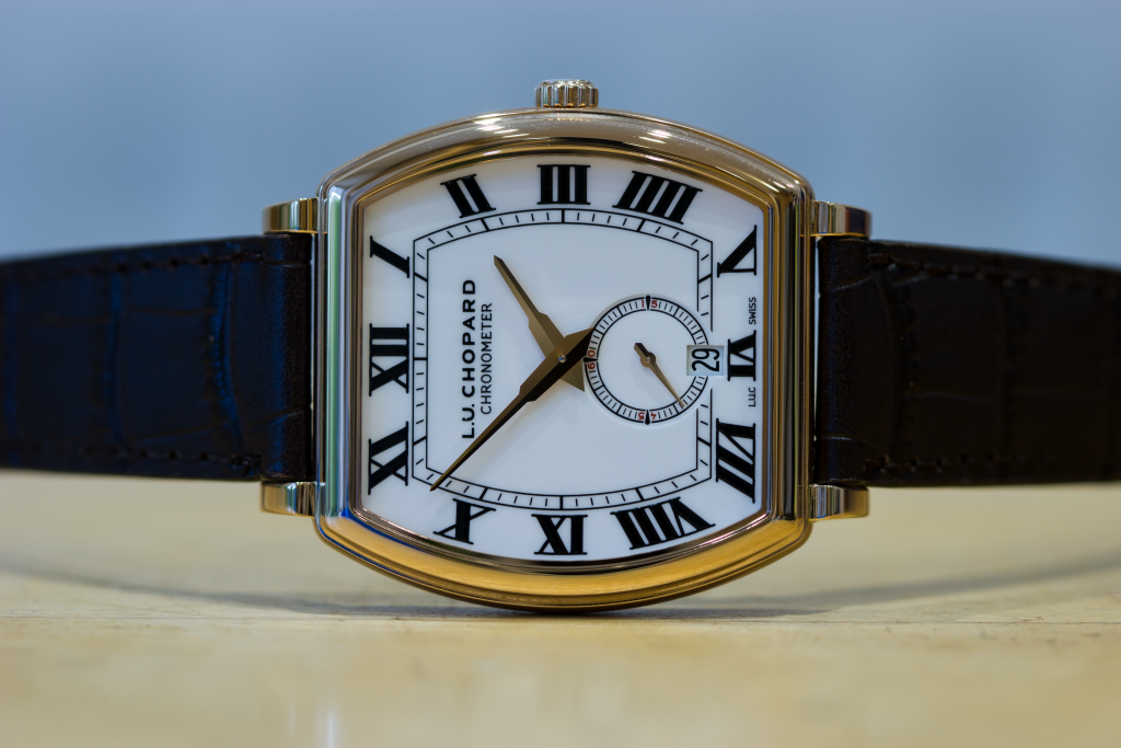
Before this experience believe it or not but I’d never actually worn a tonneau-shaped watch before, sure I’ve written about them often enough, and I do like the looks of things such as the Vacheron Constantin Malte and Breguet’s Héritage collection, but this one is a bit different from those in a few ways. In fact, I’d go so far as to say this watch is an amalgamation of both, a combination if you will, a combination of the best parts of both watches. Admittedly, however, the Breguet’s influence on it is somewhat limited to the rounded tonneau shape as opposed to the more angular Malte, I know big deal right? Still, it’s something. The fact that it is this rounded shape is also somewhat coincidental given that the shape is that of a miniaturised wine barrel, given that a grand cru is a type of fine wine it all starts slipping into place.
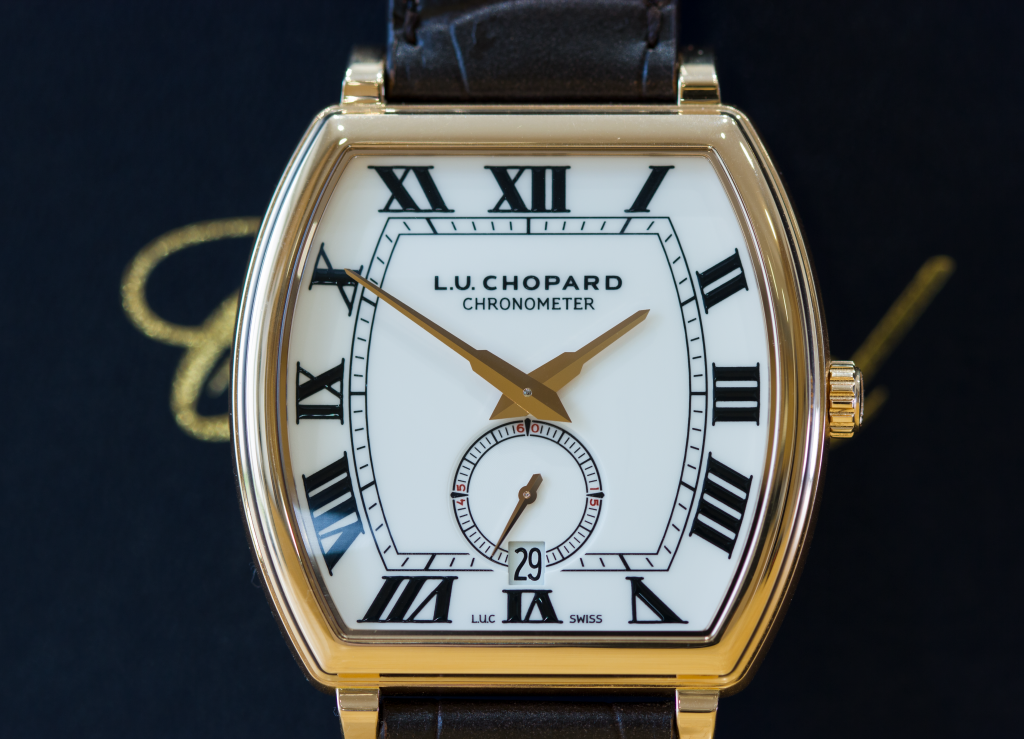
The thing that greets you instantly when you see this watch is the dial and the depth and contrast of the markers on it. The dial itself is a pure white gloss, it isn’t actually ceramic but it could fool someone who doesn’t know what ceramic looks like under a loupe. Neither do I feel like it was meant to be ceramic but Chopard ran out of time or money for the project, it looks great as is. I couldn’t capture it with the camera but there is a depth to the Roman numerals on this, they bubble up almost in the centre and are also deeply shiny, Chopard could choose to do away with the ‘CHRONOMETER’ writing on the dial, but it’s in a lighter font and isn’t very intrusive even when scrutinising the dial through a loupe. The icing on this so far monochromatic cake are the rose gold hands which have Chopard’s unique and distinctive gilded dauphine hands, while some think they just don’t look right I’d argue these gilded dauphines are more pleasing to the eye than the traditional design, although both sides are polished on this which means they shine like two golden swords.
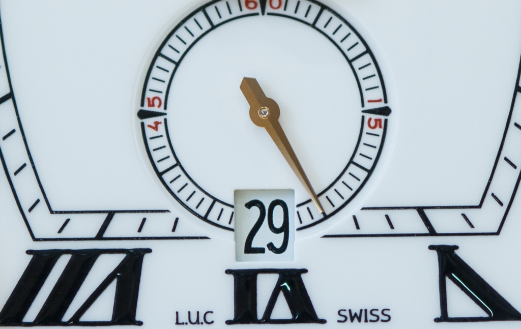
The running small seconds hand positioned at 6 O’clock is the traditional dauphine style, however, with black markers as well. This leads me onto discussing the first of the albeit few flaws I’ve found with this timepiece. At 15, 45 & 60 seconds there are enlarged markers with numbers surrounding them, I feel that with the overall simplicity of the design of the watch these numbers are redundant. Anyone who knows fine timepieces knows what it means when the seconds hand is pointing directly upwards, and in any case the sub-seconds dial is too small to see very well anyway, but I’m certainly glad they didn’t use a central seconds hand instead so bonus points for that. It’s also nice to have a quickset date window on this watch too, it’s perfectly positioned at 6 O’clock replacing the 30 counter on the subdial, there isn’t a lot of visible depth to the date window as it should be, and the numbers are printed in the same shiny font as the rest of the dial.
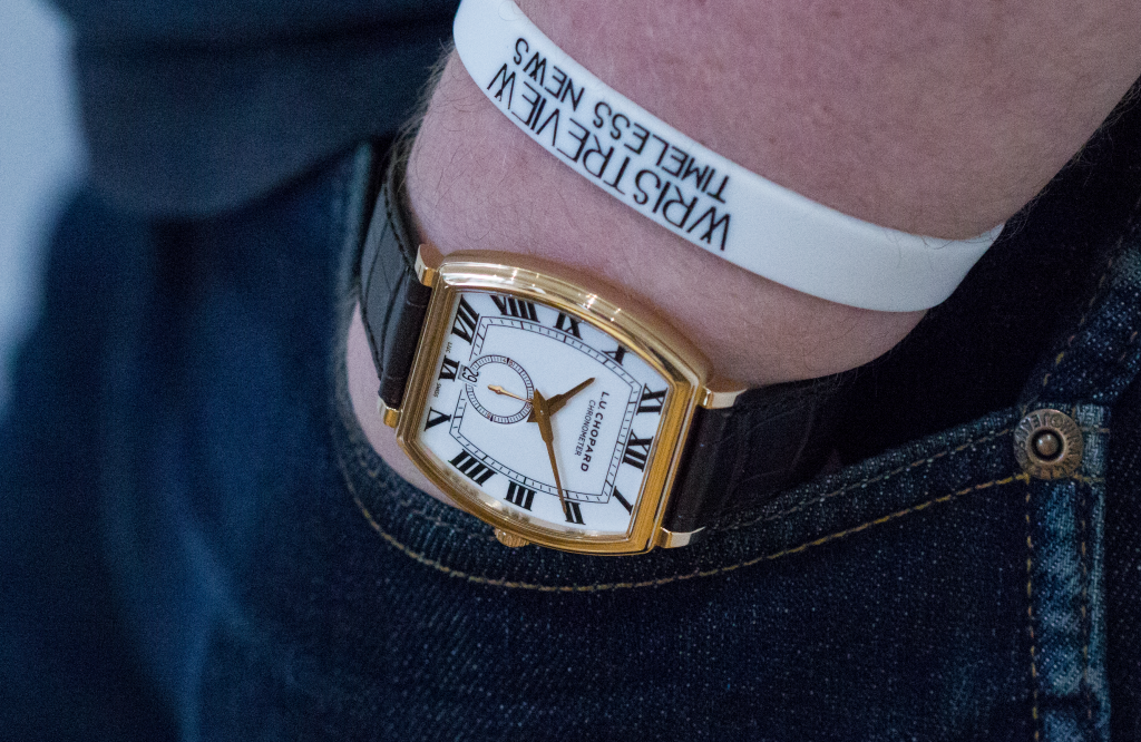
When you put the watch on the wrist you’ll notice how light it is, even for a gold watch. It’s because of the fact that there isn’t actually that much gold on it. Before you jump to any conclusions it’s definitely not plated or anything like that, even the notion. No, it’s because the watch is pretty conservative in its sizing, the dimensions of the case are 38.5mm x 38.8mm and the delicately curved case is slender at 7.74mm. It’s also using a trick Lange does quite often to make the watch seem even thinner still, by polishing the bezel on the front and the caseback but brushing the sides of the case it makes it seem more like two shiny parts are floating seamlessly, a little touch can go a long way after all. The crown is a little on the small side in terms of diameter, but there isn’t a lot you could do without it becoming offensively large, it is still easy to operate and the seconds do hack on this piece which is a bonus when it comes to photographing the watch as not only can we get some lovely looks at the balance wheel when it isn’t operating at 4Hz, but also means I can set the time backwards so it’s easier to keep the watch at 10:10.

This neatly brings us to the main event of this watch, as much as I love the look of the dial and the feel of that cool 18K gold on my wrist, the pièce de résistance of the timepiece is the movement on this watch. There have been quite a few articles posted in the last three to five years regarding how serious Chopard is about Haute Horlogerie so I won’t need to go into super detail about that. Just for your information though, this watch is COSC chronometer rated and has also received the Poinçon de Genève, I won’t bore you with the details but there are several requirements regarding the quality of assembly and decoration. This watch is not QF (Qualité Fleurier) rated, though I do seem to recall that this could be a possibility if a customer so desired, for a fee of course.


