By Jovan K
This elegant watch would not have come to life without the generous funding from Indiegogo. The efforts of Sujain Krishnan paid well in fact, I’m happy he left his well paid IT job just to pursue his passion for watch making. The sheer passion reflected in the Flinders Watch is simply brilliant. It’s profoundly charming in all sense and well prepared for any occasions for it really blends well with either casual or formal occasions. Such is the product of real dedication, where real excellence becomes the only result.

Sujain Krishnan took inspiration from the quintessential architecture of the Flinders Street Station in Melbourne in the creation of the Flinders Watch. One glimpse at it from a typical person simply makes it an everyday design watch but that is where the secret of the Flinders Watch truly lies. It’s built with a complex mixture of elegance and versatility making it a perfect value watch which goes for about $475, not bad for a high quality watch that breaks the barriers between expensive watches and value watches.

The case
The daring look of the Flinders Watch is practically the conclusion of the careful planning of its case. The 316L stainless steel is the best decision ever made by its creator since it highlights the unique distinction of having a definite separation between the main case section and the lugs.

A careful examination of its sides reveals polished material and this is quite a feat pulled off by the Flinders Watch. Considering its value, I was not expecting it to have an effect like this since that is given off only by the watches in the high end spectrum. This remarkable feat is highlighted by the clever arrangement of its top bezel, mid case and lugs, and case back by which the Flinders actually attached the lugs to the case back separating it completely from the mid section.

I liked how the push-pull crown appear so splendidly machined sporting deep-grooves and Melbourne Watch Co’s “M” logo on the side. It has firm grip to it and shines brilliantly from the brushed edge of the case.

The dial
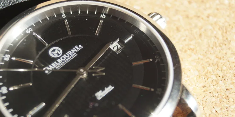
I admire how the Flinders watch dial exudes its own class. It’s available in black or silver but thanks to its distinct hues, reacting from the right light source makes it appear as white or light grey complementing its strengths in simplicity and elegance which is again, known only in the high end watches.

Zooming in at the center of the dial, I feel like I’m looking at ornaments of parallel lines exploding into faux fireworks. Truth is that I simply adore how things turned out to be so dynamic in this area. It really makes it nice looking at the time and simple enough so as not to get you overly distracted. It contains subtle elements affected by natural light creating shadows and reflections that ultimately enables you to notice the sizable set of Melbourne logos in both text and icon just below the twelve.

Another remarkable choice of the Flinders watch creator is the choice of hands. They simply complete the elegance exuded in simplicity which makes them utterly interesting to look at. Somewhat appearing like a disparity to the dial, the hour and minute hands in gloss black and appearing as sharp as the Excalibur actually adds sophisticated appeal. I’m not sure if the designer really thought about this in the first place, but if they did, I’m sure I would be on the lookout for the next watch in their line.

Nonetheless, the “M” shaped counterweight to the second hand seems out of balance but its purpose complements its origins and I admire how it highlights and preserves its source of inspiration. All of these are enclosed in a flat sapphire crystal though a entry level watch would use mineral glass instead but then, it would contradict the conception of this remarkable watch. It does look balanced and makes the reading easier thanks to its natural anti-glare properties perfect when out on a sunny day or when there’s extremely white everywhere in winter.


