BY HARLAN CHAPMAN-GREEN
Believe it or not, this is an review I’ve been trying to put off writing. Fortunately, a hectic schedule has done that for me, but it can only go on for so long before it’s time to face the music. The reason for my apprehension is this: I don’t know exactly how I feel about the new Zenith. Parts of me really love it, other parts of me don’t like it at all, and some are just a little underwhelmed. To preface this Fortnight Review, I’m not saying I’m disappointed by this watch as a whole; I thoroughly enjoyed my time with it, but some parts make me think in uncharitable ways. Let’s get started.
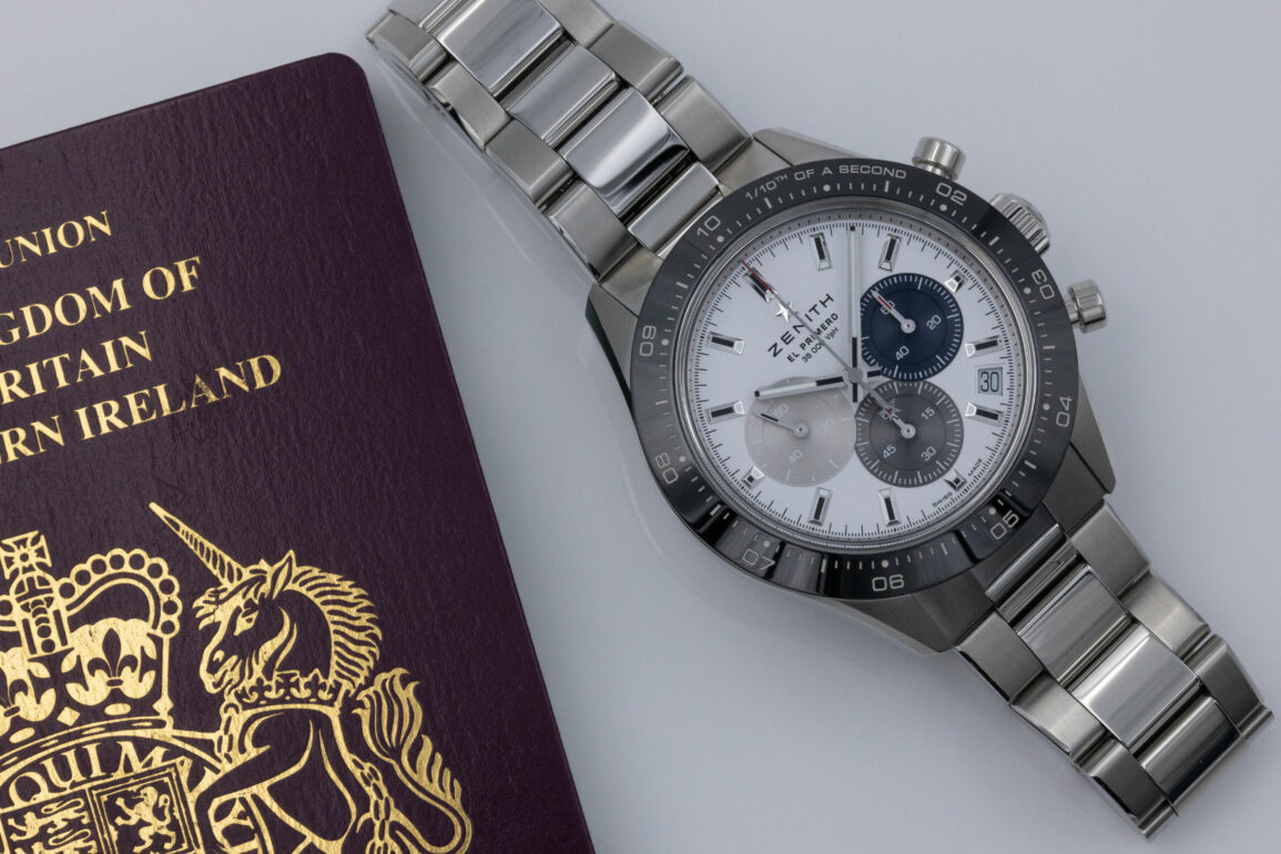
To be honest, I shouldn’t have prefaced my review with that last part. So, let’s preface the preface to the review with a small disclaimer in that, for reasons beyond my control, I was only able to get a hold of the white dial reference Chronomaster Sport. You won’t see any black dial shots here or any rubber straps; perhaps in the future, there is a possibility of that, but I think most have already made up their mind on this watch. Now that the dust has settled, we can take a proper look at the new Chronomaster Sport.
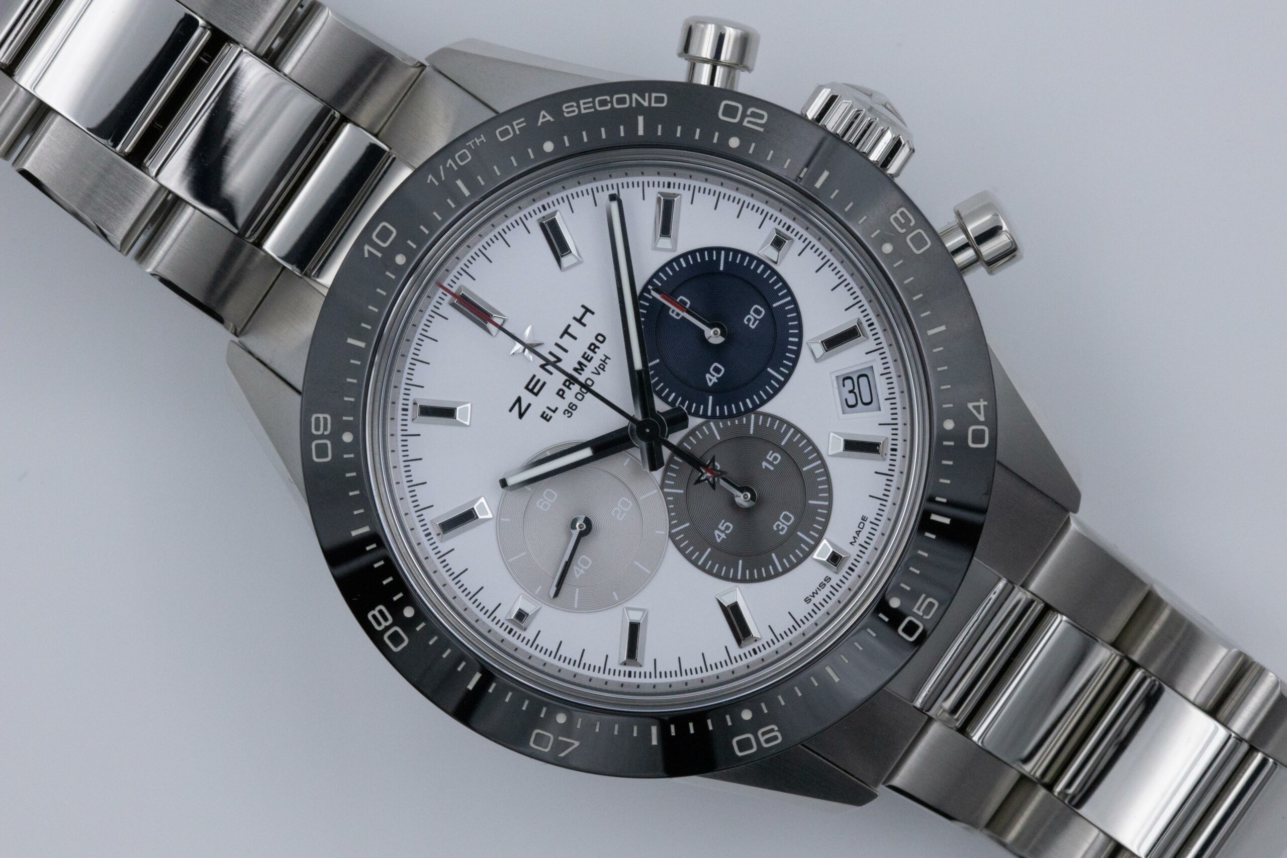
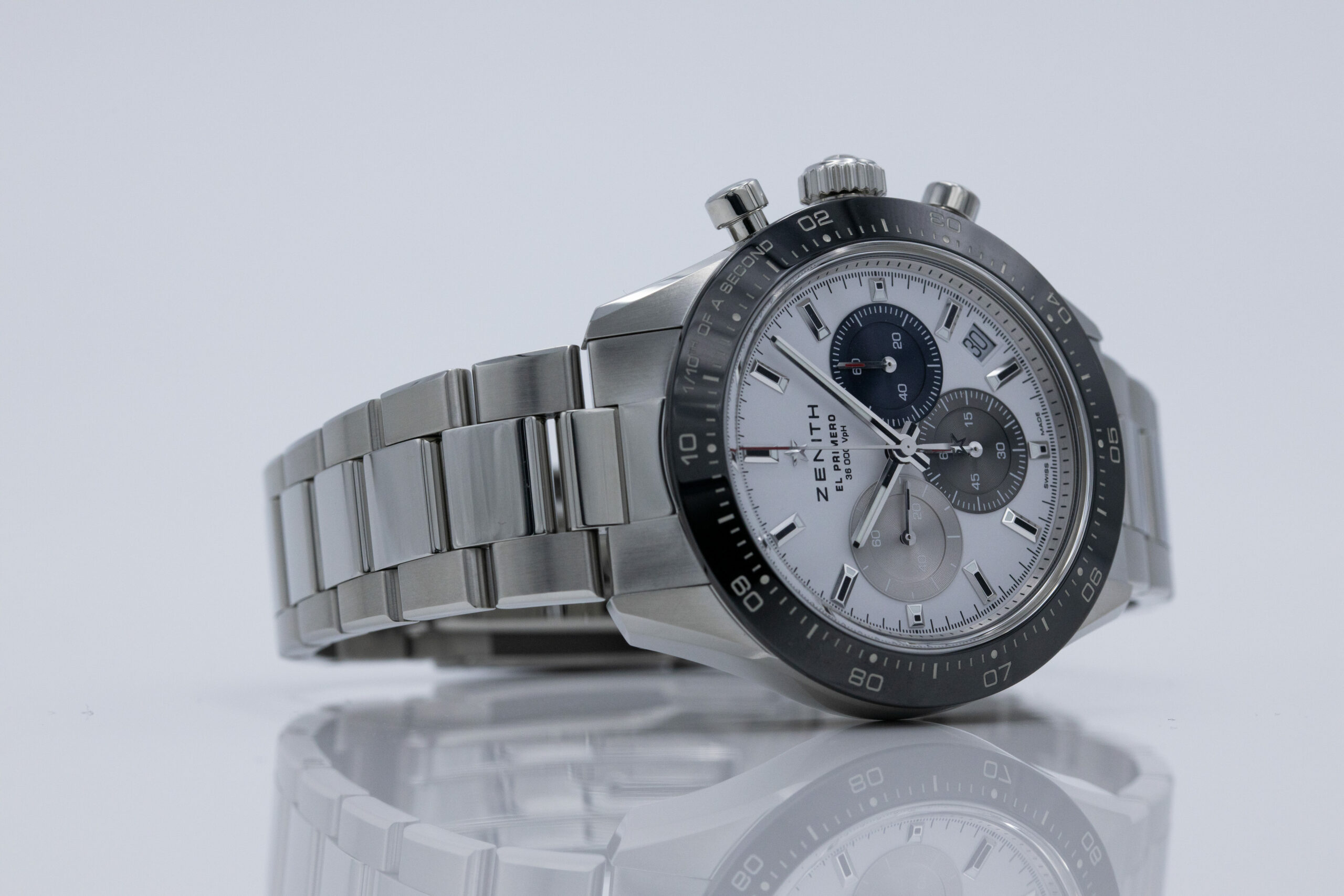
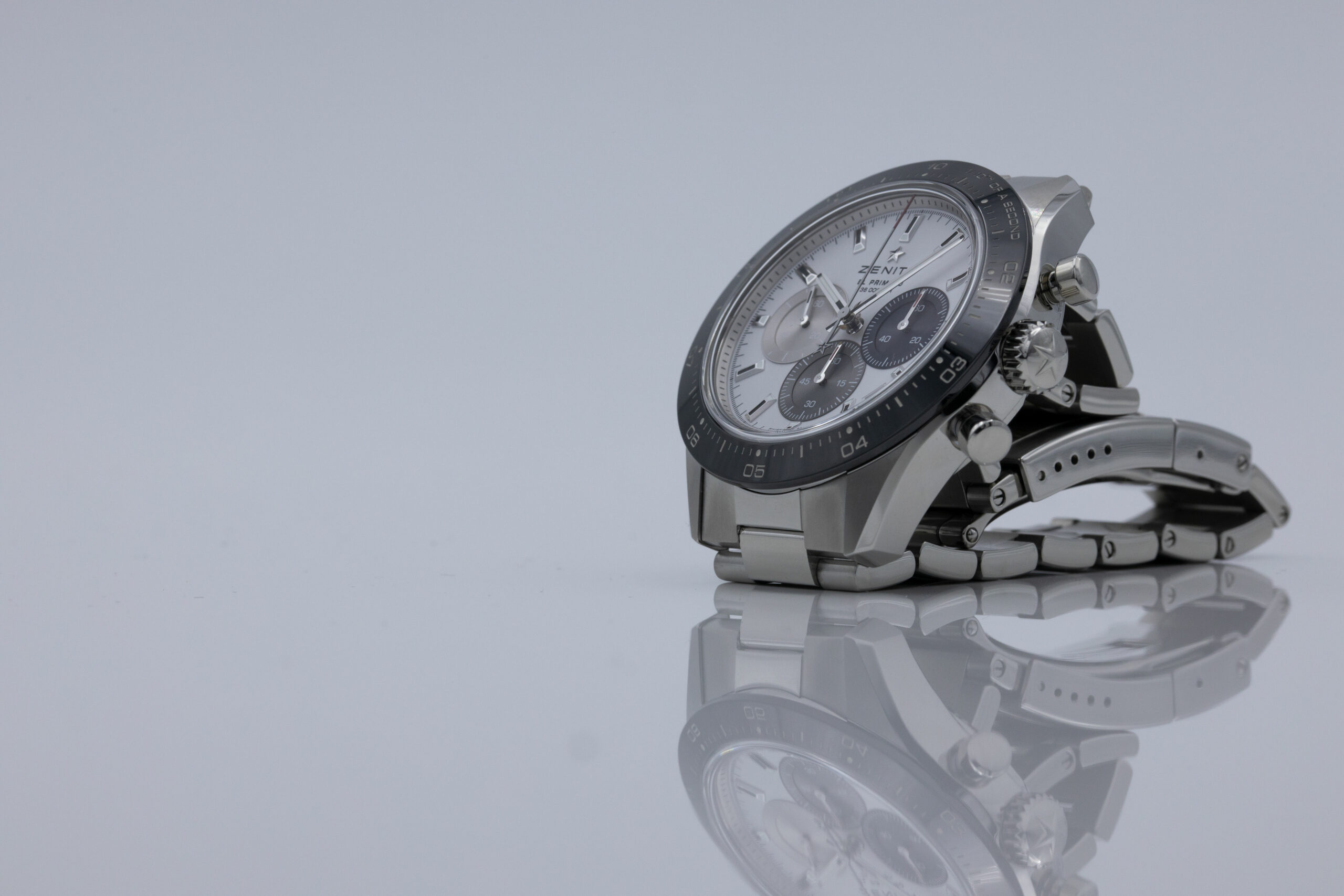
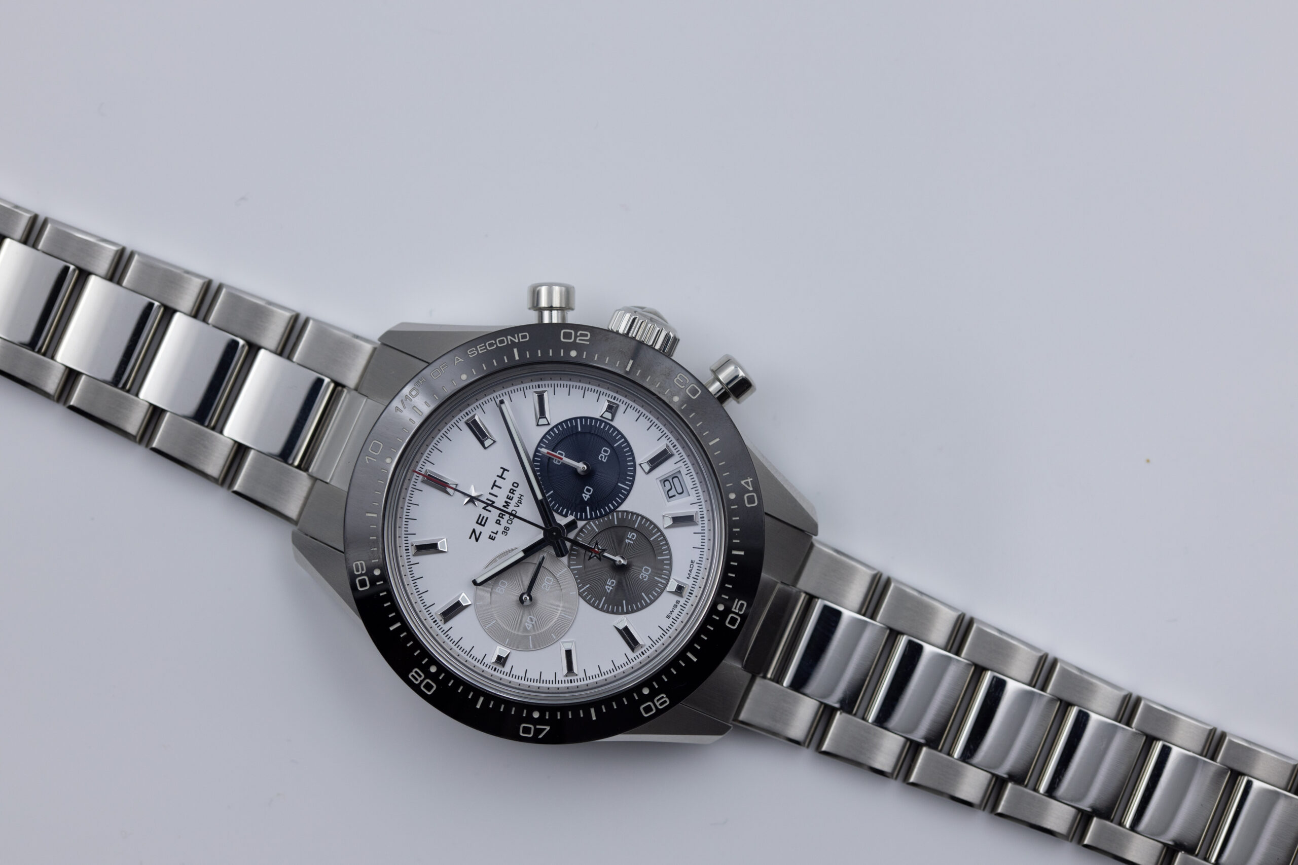
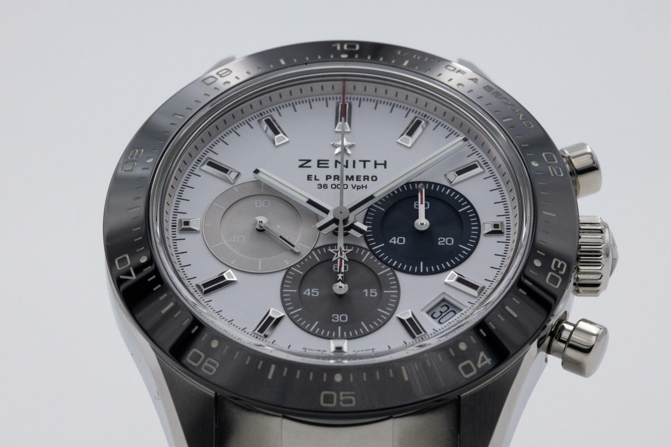
Right from the beginning, it’s easy for me to say that this is an attractive watch. I love how the dial is laid out, it’s a traditional 3-6-9 layout for the chronograph, but it still feels contemporary. I think part of that may be to do with the fact that the dial’s white is a stark white. I guess we could call it surgical grade white because it’s as pure white as every hospital in a movie set in the future. It does a lot of justice, and it interacted well with the white backdrop I used in my photography. I also used a white ceramic tile as a base, which is where the reflections are coming from.
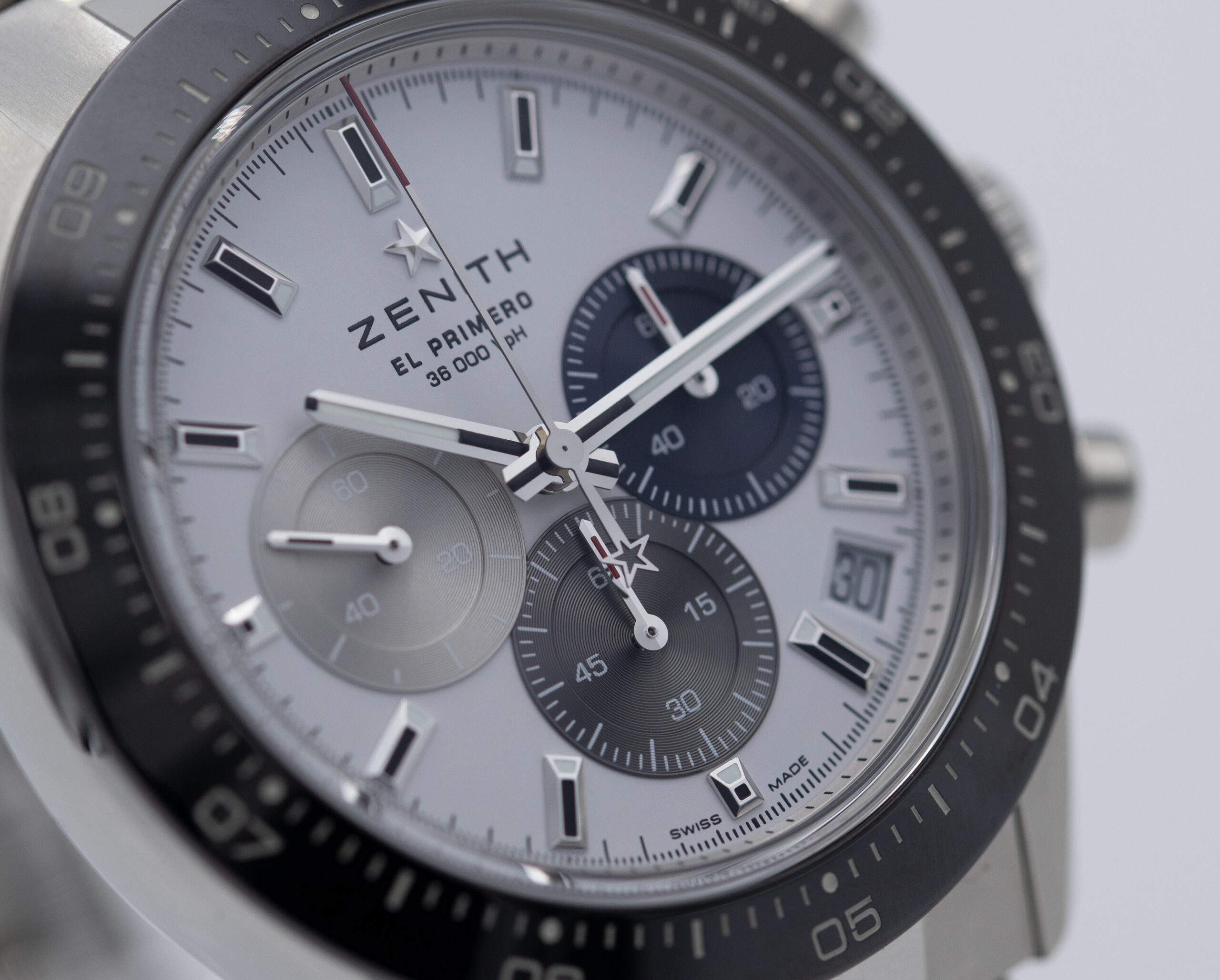
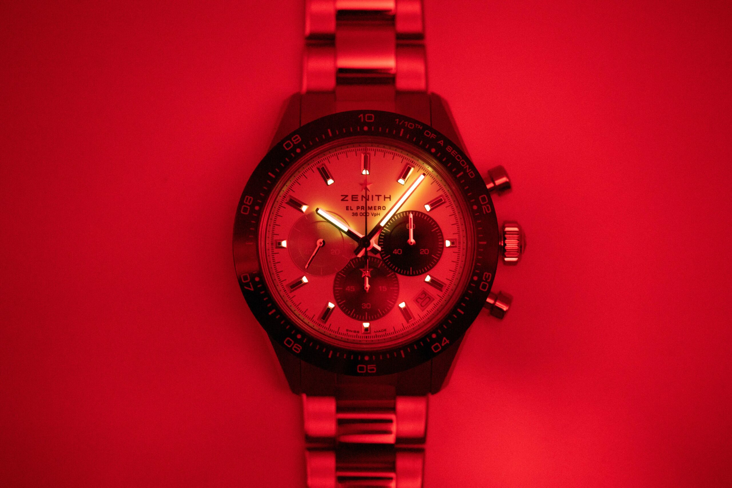
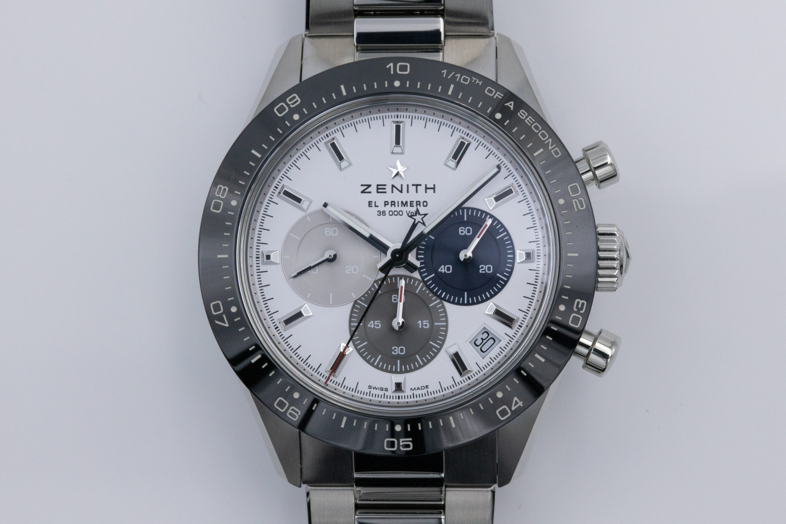
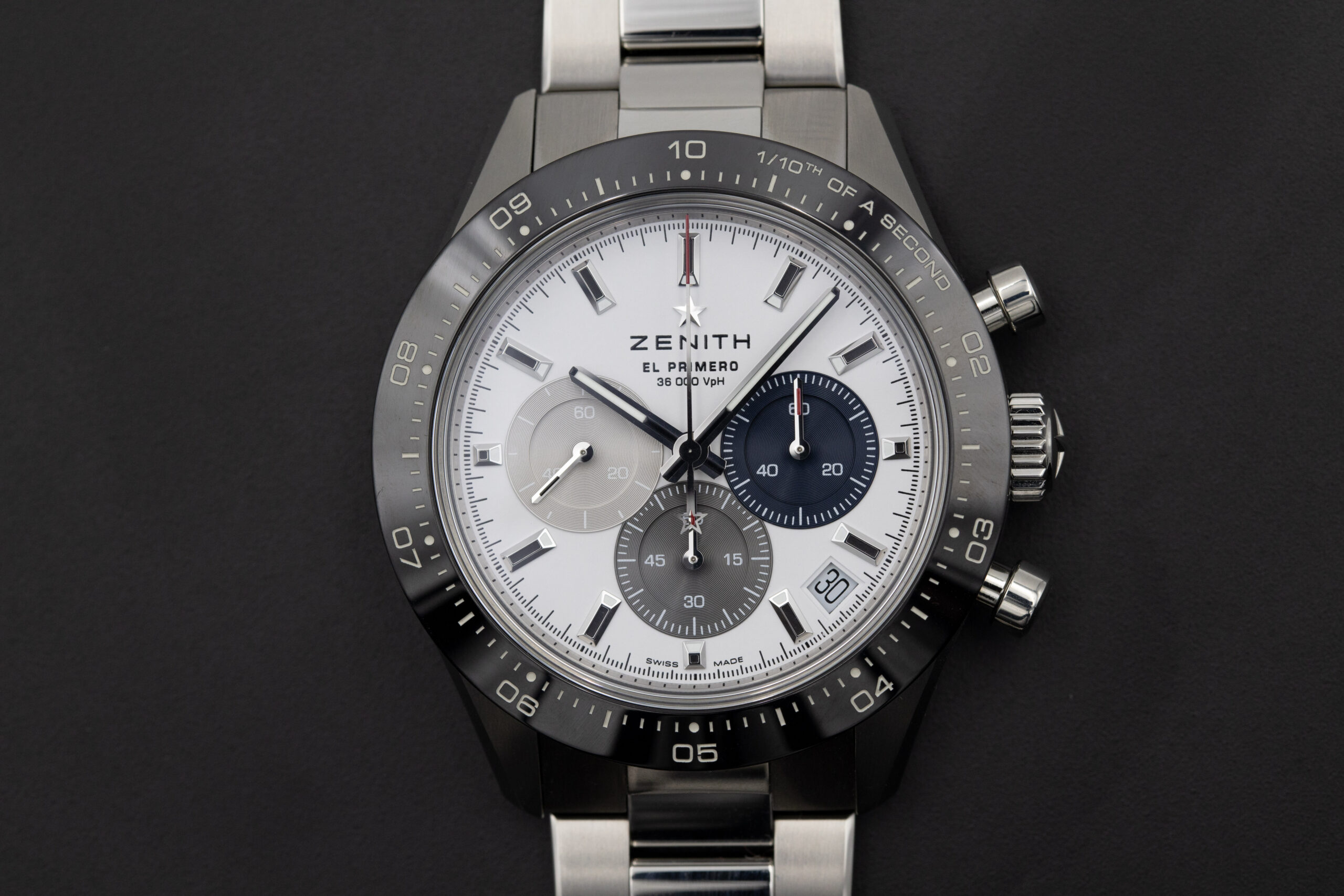
Back to the watch, a lot of the dial’s features have been applied. Gone are the days of printed everything-on-the-dial watches, at least for Zenith. The markers of this watch are like trapezoidal prisms standing tall above the rest. They have a black finish to the top, which provides some contrast, but it limits the watch’s legibility at night. There is lume on this one, but it’s only applied to the slanted inward-facing edges of the markers, limiting surface area. There is also a small amount of lume on the hour and minute hands, but there’s nothing for the chronograph at all, which means it’s unusable in the dark.
Nightvision mode: ON
The dial has a few peculiarities that caught my attention (in a good way) as well. As well as the black tops to the markers, Zenith added black to the hour and minute hands and red for the chronograph indications. They could have easily added lume here, but they didn’t, no idea why, and the red is only apparent on the seconds hand. I like how Zenith didn’t put a border to the date window they sandwiched at 4-30. While it is nice to see brands making an effort with their date windows, a chunky surround would have been too much, in my opinion. Take a look at our coverage of Grand Seiko’s recent SBGC240 140th Anniversary watch for a good example of when I think designs go too far. To show they have made an effort nonetheless, Zenith added a small section around the date window that’s lower than the rest, it’s less intrusive, but it’s still noticeable.
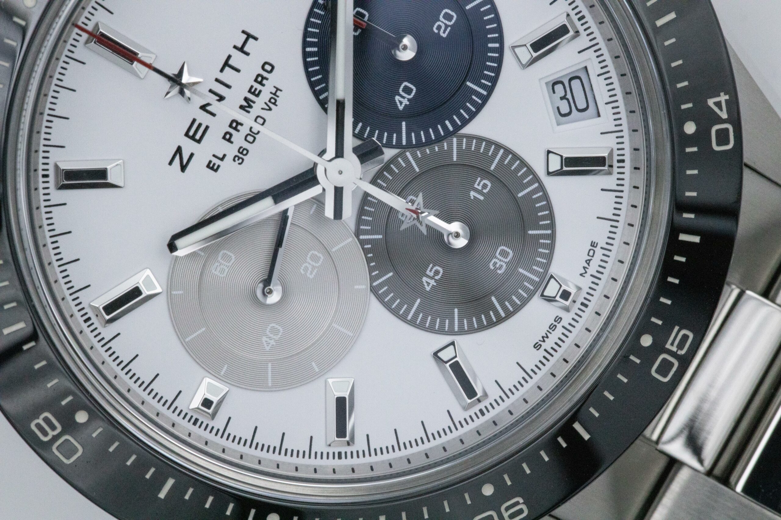
However, what made me chuckle the most is that Zenith added markers for the chronograph seconds hand three times. There are the markers on the dial, pretty standard stuff, and then there are seconds markers on the inner flange ring and again on the black ceramic bezel. Again, I’m not really sure of the purpose of all these markers in close proximity, but it’s quirky.
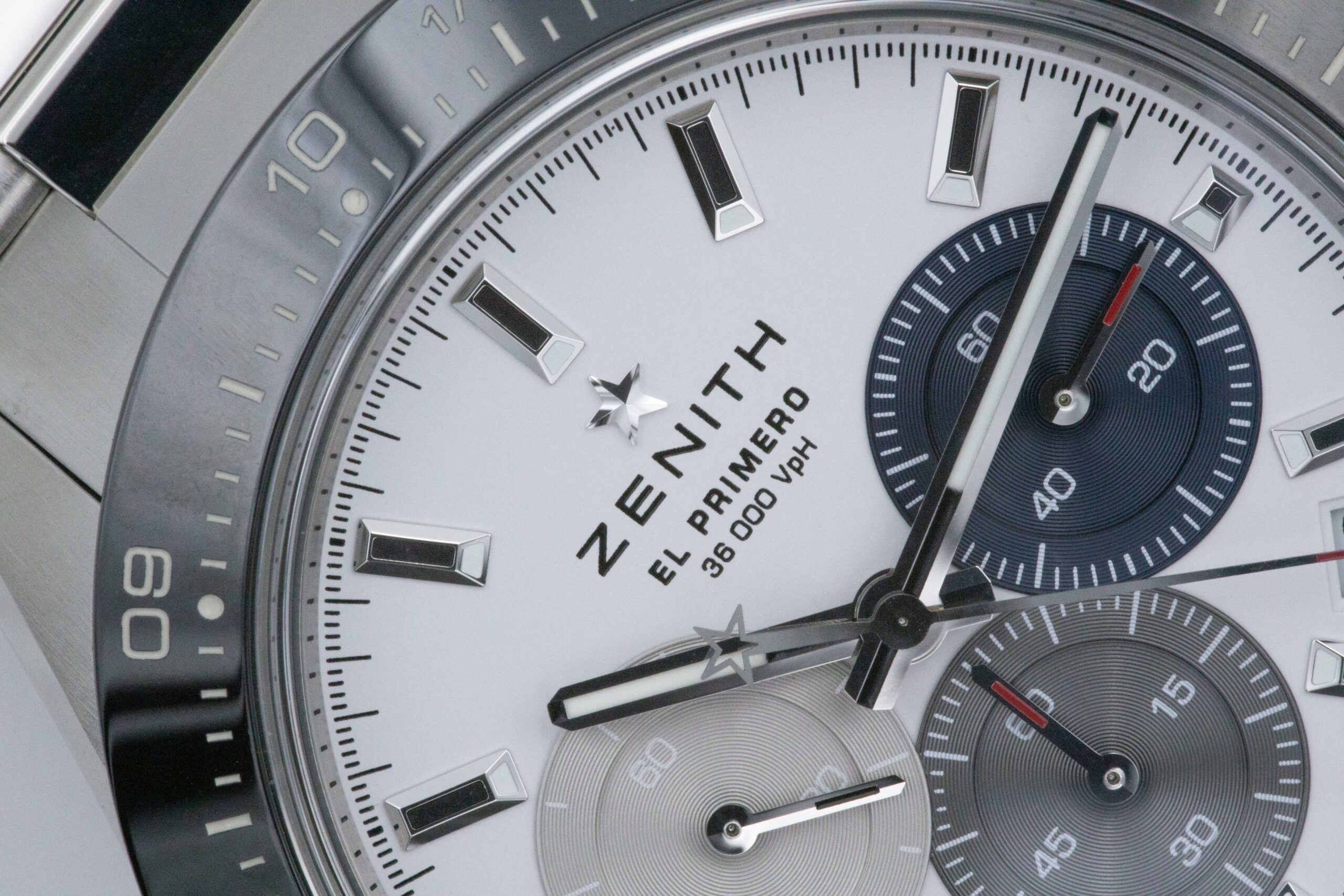
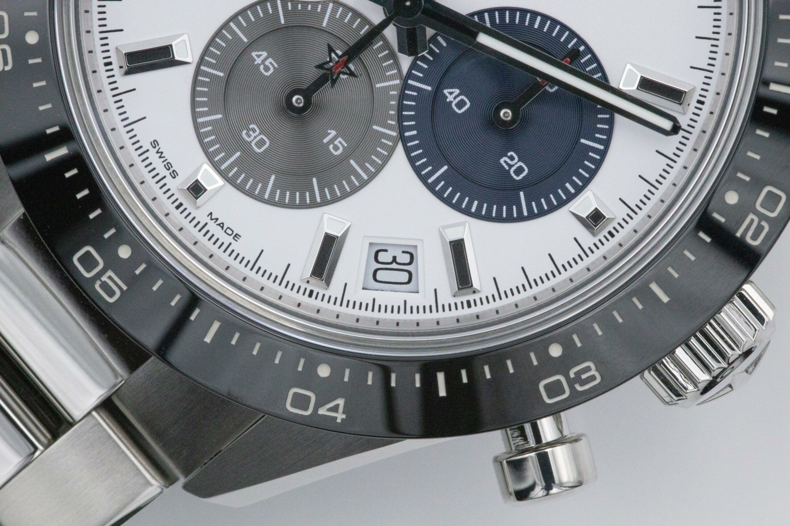
There are some classic Zenith design twists to the dial, such as the star logo, which is applied rather than printed, and the star-shaped counterbalance on the chronograph seconds. The coloured chronograph subdials overlap very slightly, which is a tradition for Zenith’s chronograph watches. The traditional El Primero colours are also present on the chronograph subdials. However, I noted during photography that it was difficult at best to get the blue subdial at 3 O’clock to look, well, blue. It appeared as quite a murky blue/grey in my shots, which may have been intentional, but I feel a little more intensity in colour would have helped.
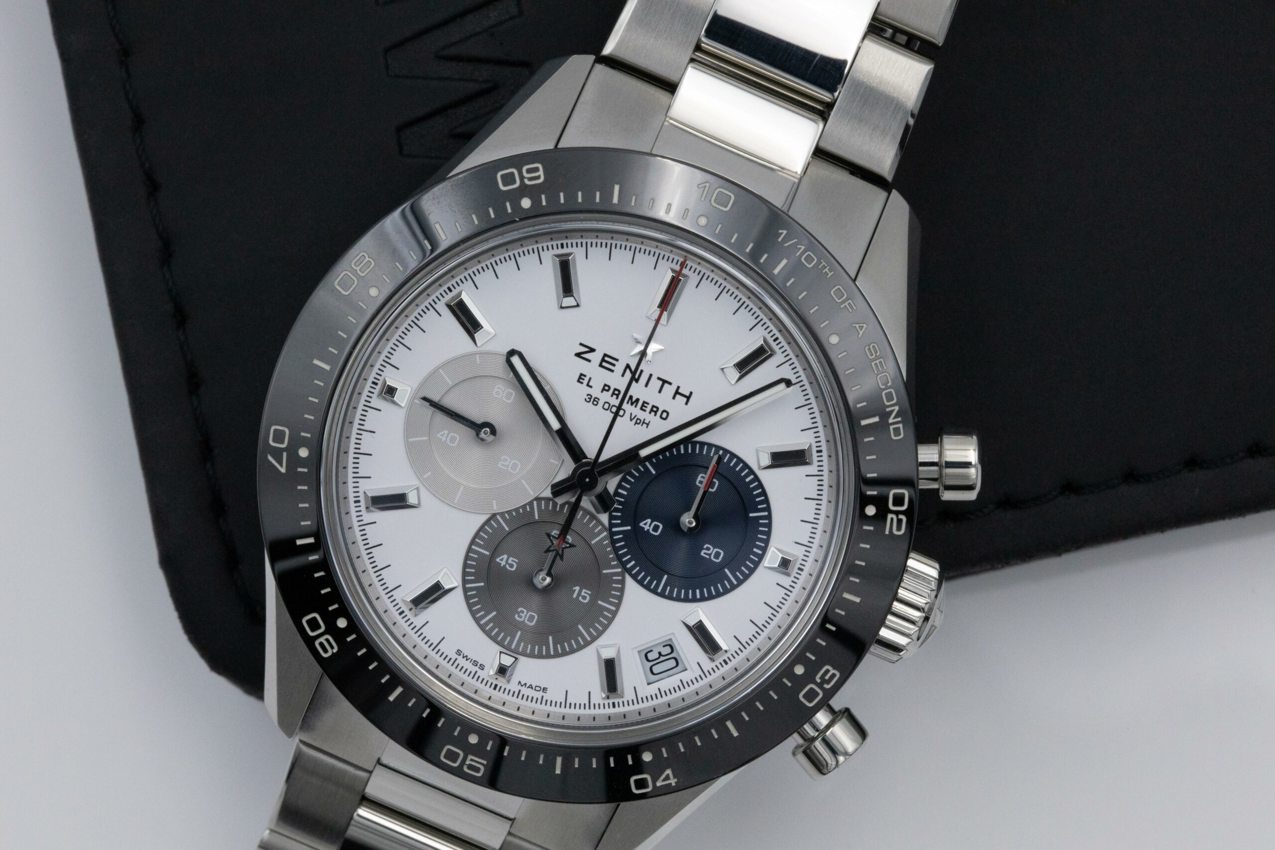
The watch is legible, and I have no choice but to give it top marks for that. Despite being a reasonably-sized piece, I could still read it clearly. The chronograph is an interesting one; Zenith claims this is the first time that a 1/10th of a second scale has been put on the bezel of a watch. If that’s true, which it probably is, it’s not very interesting. The fact the chronograph can measure and display 1/10th of a second takes precedence here; it’s almost hypnotic. I think its practicality is fair. I’m not sure entirely how useful it is to time such a small increment, especially as you need to read a subdial if you forget to count how many times the seconds hand has performed a rotation. Some kind of jumping hand display may have been more useful here, but added complications mean a price increase.
You might be thinking, “Well, hang on, Zenith has already incorporated a 1/10th of a second chronograph, so it can’t be that hard to add an extra function”, and you’d be right, sort of. The new movement of the Chronomaster Sport is the other big revelation Zenith pushed when this watch was initially released.
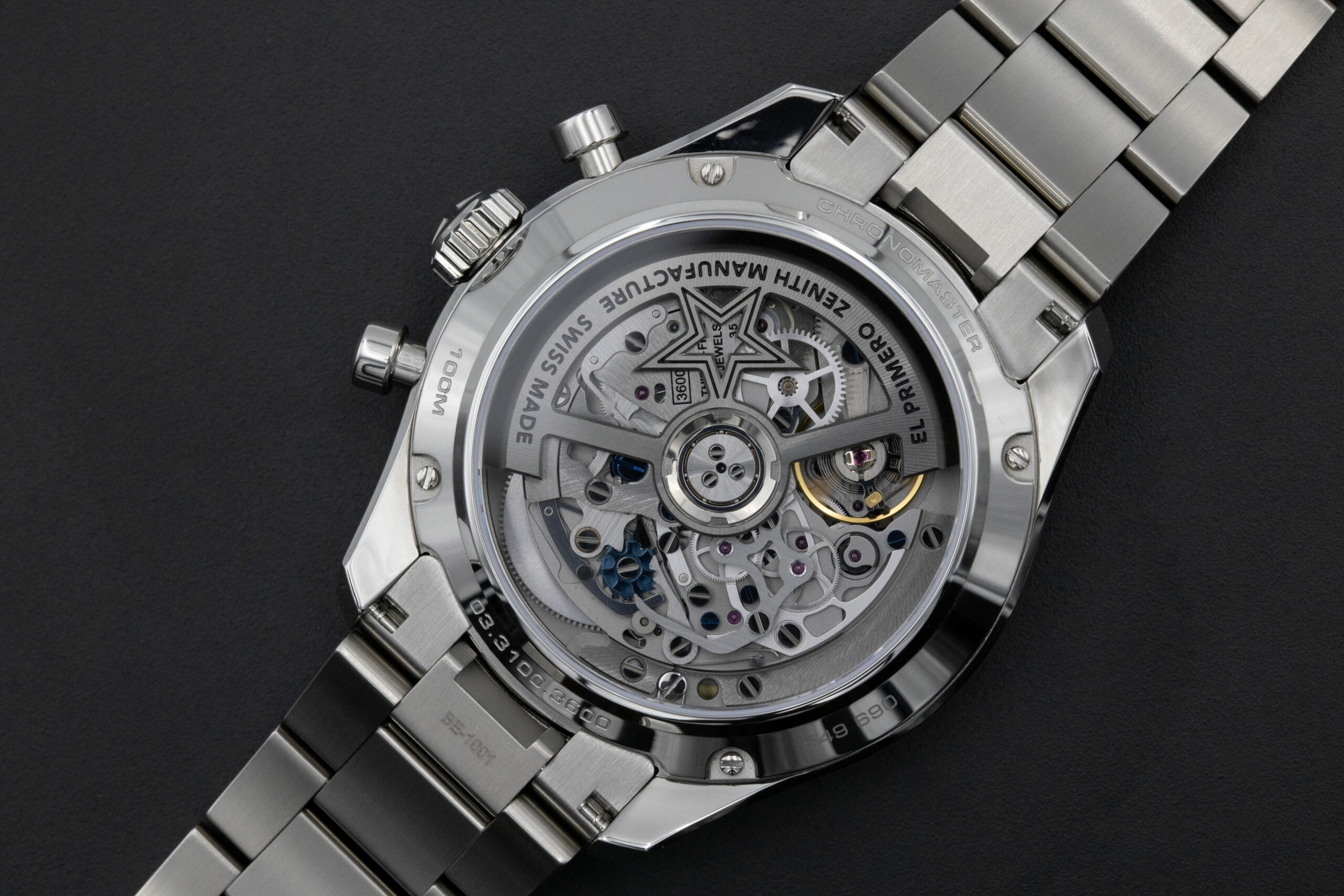
The latest generation of the El Primero family of movements is the Calibre 3600 seen in this watch (and also in a few limited edition pieces recently). A few changes to the El Primero movement design have granted Zenith access to an entirely new range of timing options. For the calibre 3600, Zenith changed which wheels drive the movement and the chronograph. Now, the chronograph is being driven directly by the escape wheel when running, and with the balance wheel oscillating at 5Hz rather than the usual 4, an innovative set of gearing ratios allows the Chronomaster Sport to measure 1/10th of a second without the need for a second balance wheel and escapement assembly. Granted, on the dial side, I questioned whether a 1/10th of a second display is actually useful, and yet I can’t help but love the fact that Zenith made these changes.
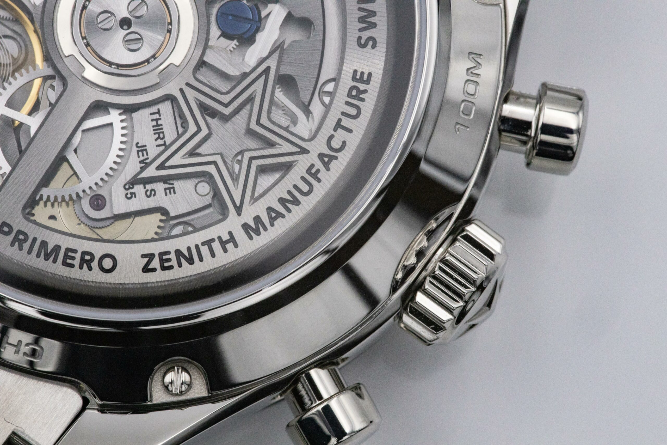
You lovers of technical specifications reading this, I am only too happy to oblige. The El Primero Calibre 3600 features a 5Hz beat rate which is the standard for Zenith’s El Primero movement (and it has been since forever, basically). It features a hacking seconds function for accurate time setting and a power reserve of 60-hours which is wound by the automatic partially-skeletonised rotor. There is also a quickset date function.
The El Primero Calibre 3600 features a blued column-wheel chronograph to control the operation of the mechanism. I noticed during my time with the watch that there was a bit of skipping when starting the chronograph, it wasn’t severe, and I think the fact the central seconds hand is geared to move quickly means the skipping is made more prominent.
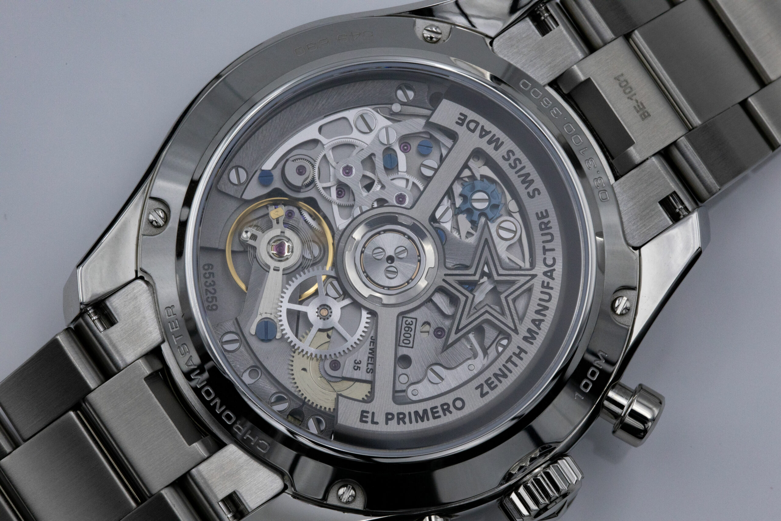
I liked the movement aesthetically from a distance. The rotor has some wobble to it like a Valjoux calibre, but it is smooth when moving. You can feel it moving when you hold the watch, but you can’t when it’s on the wrist. There’s some nice brushing on the tops of the plates and other components, but there isn’t an exceptionally high level of finish here. There’s no finish applied to any edges of plates, some small marks from machining remained present, and the blued finish on the column wheel seemed to have suffered from some damage.
It should be noted that the column wheel is most likely to see wear as the levers for the chronograph intersect with it. Granted, you aren’t paying for extremely high levels of finishing with this watch, so I wasn’t bothered by it. Remember, with high-end timepieces, you tend to pay more for simply knowing a tiny component has an excellent finish to it, regardless of whether you can see it or not.
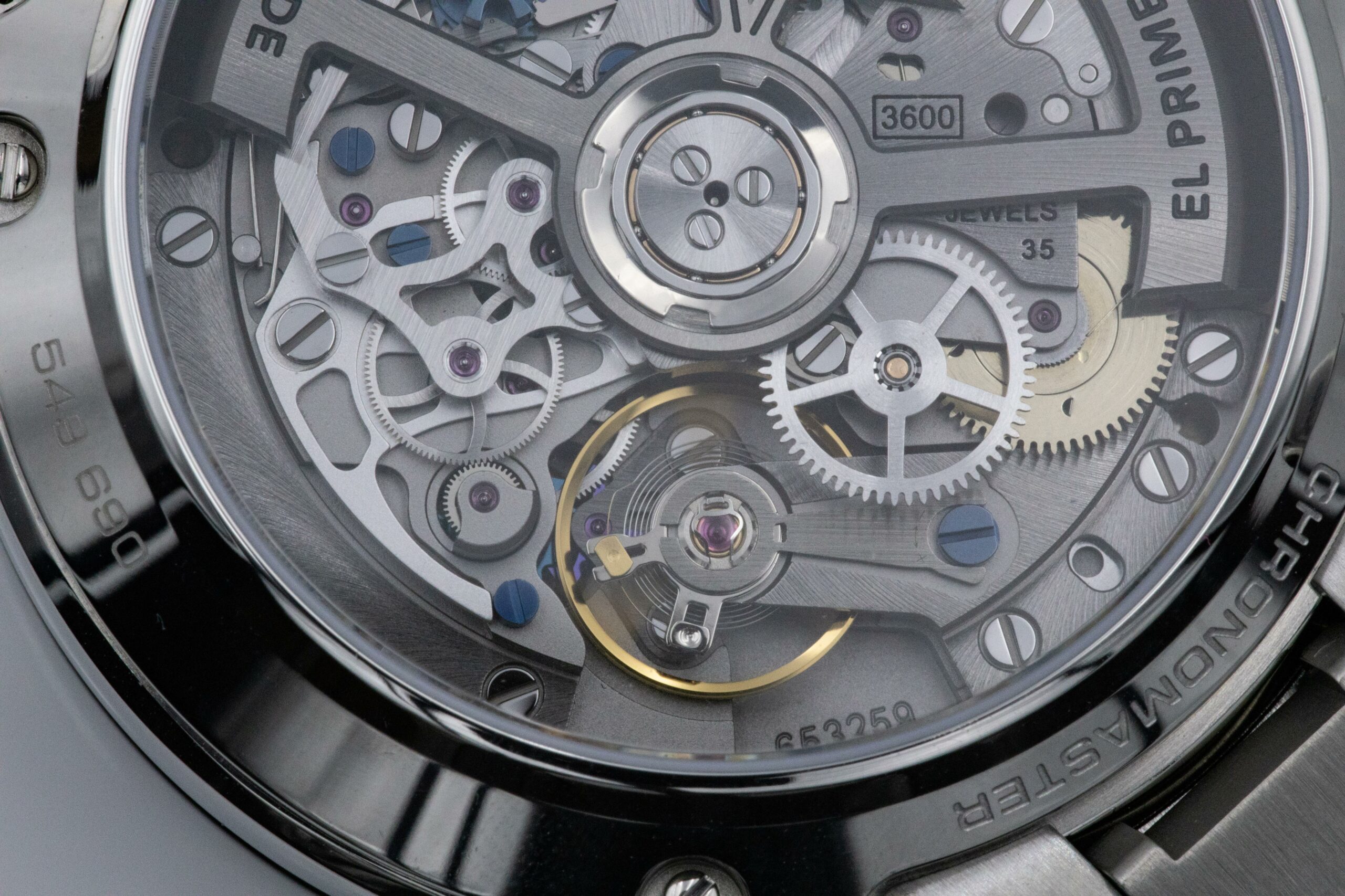
Apart from that, I had no issues with the movement, it did everything I asked of it when I was shooting, and I liked the level of depth it had. This isn’t anything like a city under a caseback like A. Lange & Söhne’s Double Split, but there are plenty of different layers in play here. It gave me a lot to play with when using my camera.
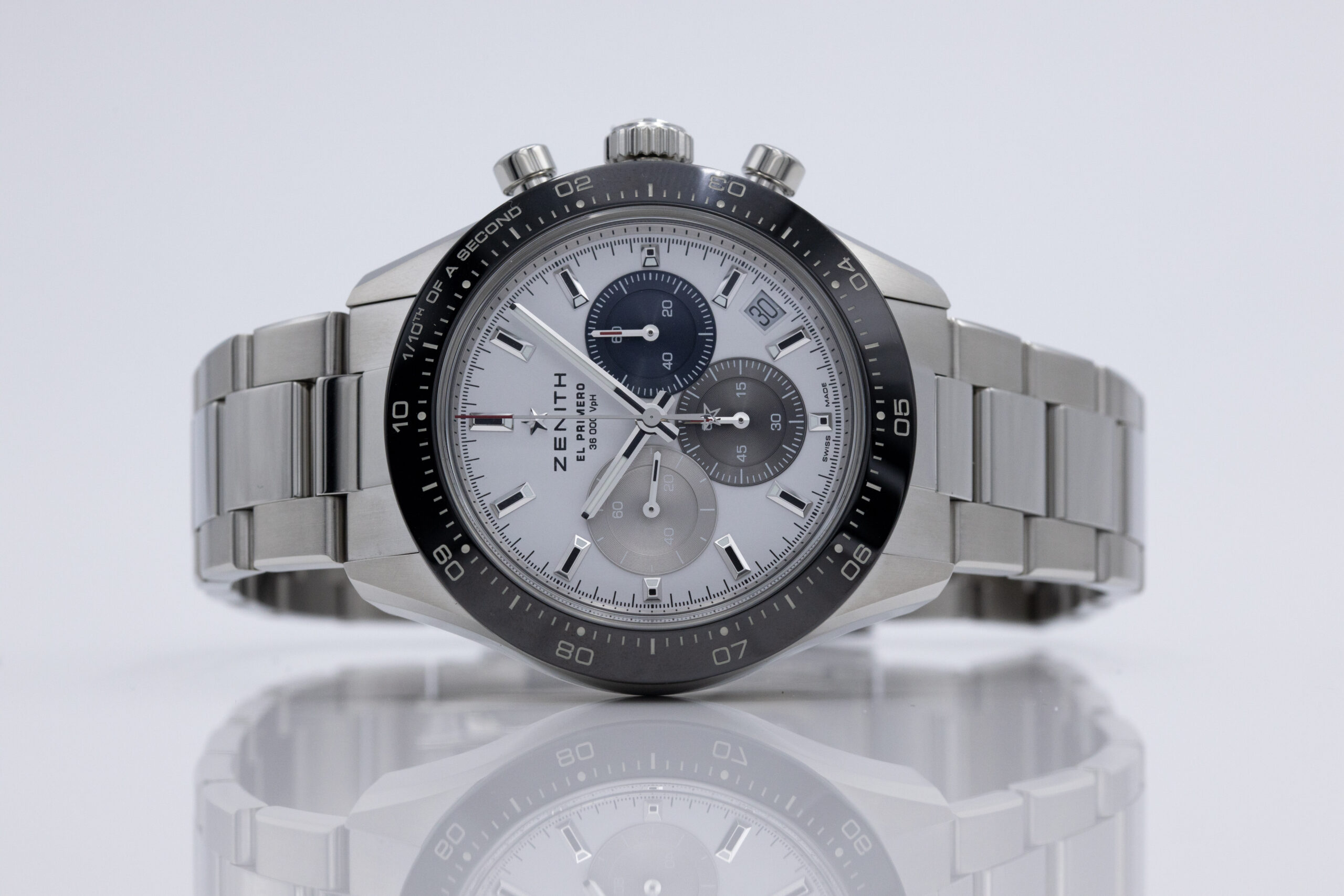
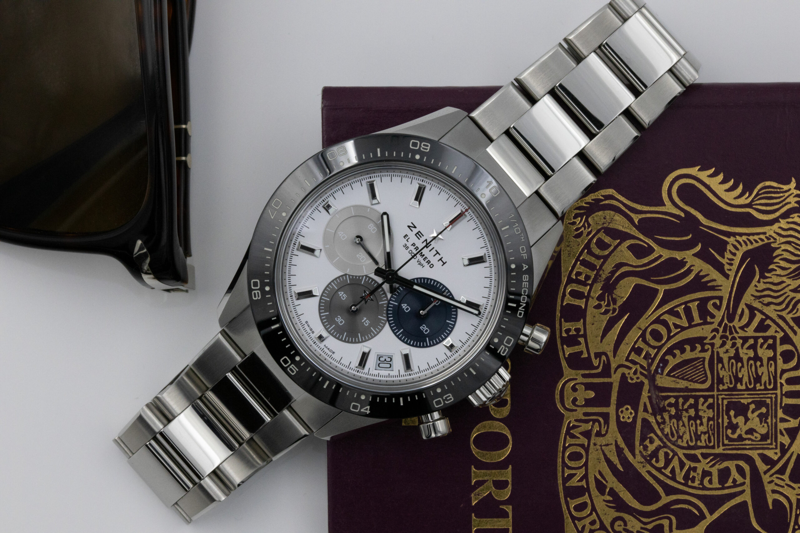
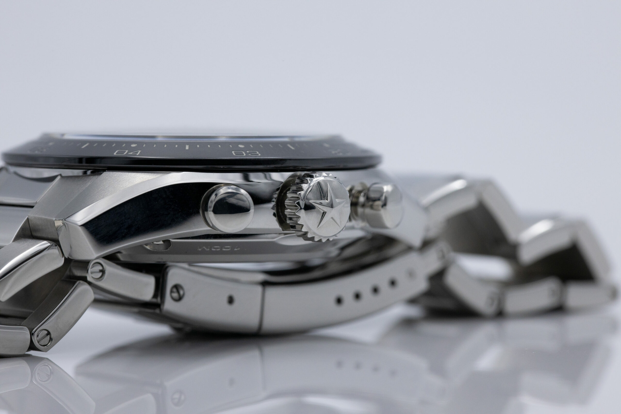
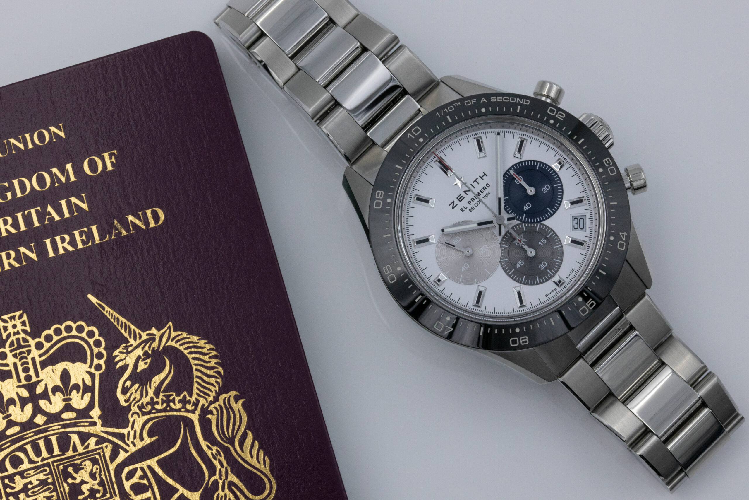
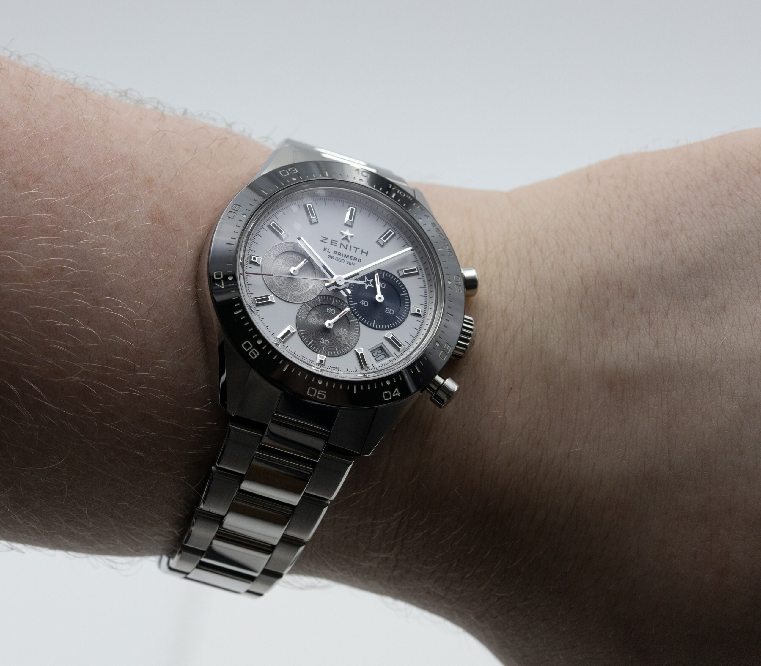
Let’s move on to the other half of this watch’s contentious part: the case and the bracelet. The case measures 41m in diameter and 13.6mm in thickness. This plonks it right between the 40mm Rolex Daytona and 42mm Omega Speedmaster Moonwatch. It’s a comfy size to wear and fitted my larger wrists well. I think this watch will fit both smaller and larger wrists than mine with relative ease. Even though the pushers stick out a little far, it’s nothing to be concerned by. The case has had nearly every surface polished. Sometimes this doesn’t work on a watch, and it makes it seem a little too conspicuous, but I think the black ceramic bezel is enough to break it up. Also, the lugs’ tops are brushed like the bracelet’s external links, which works nicely.
The watch weighs in at 147 grams on our VSS (Very Scientific (Kitchen) Scales). This means it’s just a tad heavier than the Rolex GMT Master 2 BLNR, which weighs in at 143 grams (comparative Daytona unavailable) and lighter than A. Lange & Söhne’s Odysseus in steel which weighed 154 grams. The mass isn’t too much with this watch, but that might not be a great thing.
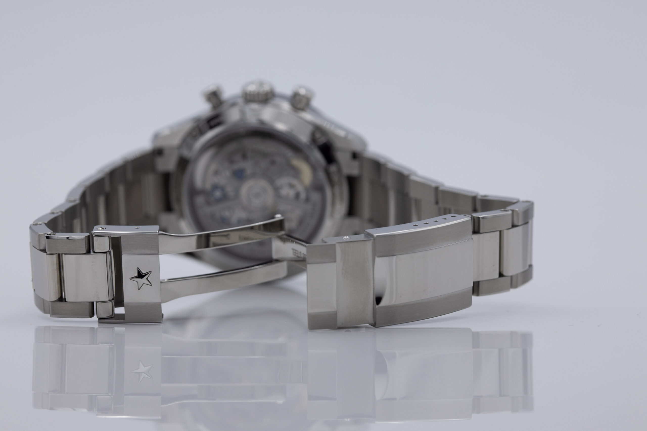
The bracelet and clasp feel… ehhhh, okay. I like the way the bracelet looks, the polished centre links look classy, and there’s enough of a gap between them that the watch doesn’t pull on your arm hair. I’ve felt more solid three-link bracelets though, heck, I think the second generation Omega Seamaster Planet Ocean had a more solid feeling bracelet. But, the Chronomaster Sport’s one does the job and does look excellent. I also appreciate that the links have been screwed in. This is the more challenging way of doing it, people.
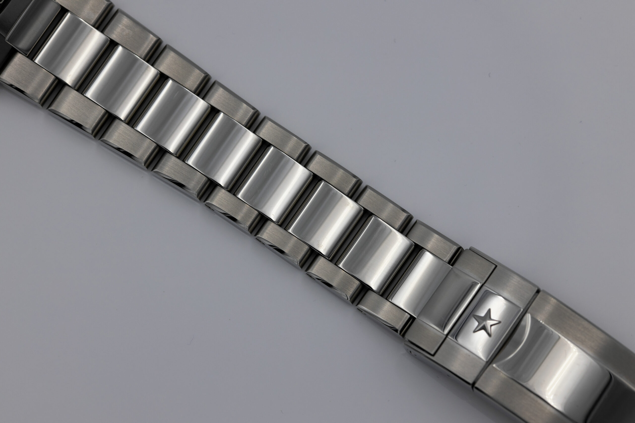
The clasp is average at best. I’ve tried to avoid saying it until now, but this looks like it was pinched from a Rolex and done worse. Other reviewers have avoided mentioning this, but I feel it’s essential to let brands know when they’ve overstepped the line. The clasp features the same brushed-polished-brushed design as the bracelet and a security arm, which resembles Rolex’s clasp far too much for my liking. Further, where Rolex made their clasp into three pieces (the part that latches to the clasp arm is spring-loaded and a separate bit for security but easy opening), Zenith’s is only made of two pieces. That makes opening the clasp harder than it needs to be and harder than it would’ve been if Zenith went the whole nine yards and used the Rolex design. Also, there’s no micro-adjustment which I think should be integrated now on a watch like this. Still, the clasp has holes in the side, meaning it is simple to resize with a cocktail stick (and makes it easier for me to get photos of the movement.
That leads me in a full circle with this watch. I enjoyed wearing it immensely, but there were parts that I felt needed re-doing. As I’ve mentioned, the clasp needs work, and the application of the lume needs a tweak to be appropriately functional at night. And the blue of the chronograph seconds subdial was just a little too muted.
I don’t believe the stigma about this watch’s design when comparing it to the Daytona, especially the hilarious notion that Zenith is paying homage to the Daytona with this watch. What’s likely tripping people up is the black ceramic bezel which looks suspiciously like the Daytona’s. Zenith has done these before, but they were narrower, which wouldn’t work without them going back to the drawing board entirely with the case and dial. I’d be curious to see what a solid white ceramic bezel with black markers looked like, even if it did make this thing a little less classy.
When comparing the individual elements of the Chronomaster Sport’s dial to that of the Daytona, there’s next to no similarity, except maybe the outline of the markers. I’ve stated my thoughts on the clasp, so apart from that, I think it’s fair to leave that train of thought where it is.
Wearing it on the wrist it was comfy and handsome. It also costs $10,000 on the bracelet, which is more affordable than a Daytona, and it’s likely to be more readily available than a Daytona as well. The Chronomaster Sport is a great watch, and I hope it brings Zenith back into the spotlight as the watchmaker to beat. I hope they don’t do any tacky rainbow versions, though.
Visit Zenith here.